Soccer or Typography Fan—Which Are You?
How a typeface can be inspired by history, look incredibly distinctive, and still solve the practical problem of communication.
I don’t know about you, but I was pleasantly surprised when I watched the Norwegian soccer team play at this summer’s FIFA World Cup 2026. No, I’m not talking about a particular through ball, a brilliant save, or their high-press strategy. I’m talking about their jerseys. More specifically, the typeface used for their names and numbers.
Well, what did you expect? Typography is what catches my attention. And when something looks unusual, unexpected, and suddenly appears - I focus harder. Norway’s 2026 uniforms did exactly that. What I discovered was even more interesting. The typeface was the result of an evolution in design - beginning with an earlier concept and then revised through collaboration between type designers Luis Callegari, Justin Tallin, and Dan Gerhardsteinan, working with Nike.
The original 2024 nameset, called Harald typeface, was inspired by Nordic visual language. The numbers were two-tone and beveled, and they looked great when viewed as a statically. But there was a problem. Regrettably, they were unreadable when the players were moving. The solution was not doing its job. And that is where good design gets interesting.
As well, FIFA requires that the Latin alphabet be used for player names and numbers. So the typeface had 2 very important reasons to evolve into what we saw on Norway’s 2026 World Cup uniforms: Taakeferd Condensed. Take a closer look at the A and the 9 in the original Harald typeface. They are intricate, unusual, and visually fascinating. But they can also be difficult to decipher. Now look at the A and 9 in Taakeferd Condensed. The Nordic influence is still there. The personality is still there. But now they are are obviously legible. That’s the part I love. The designers found a way to preserve the character while improving the communication.
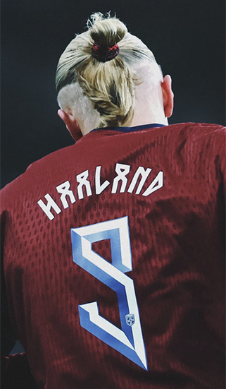
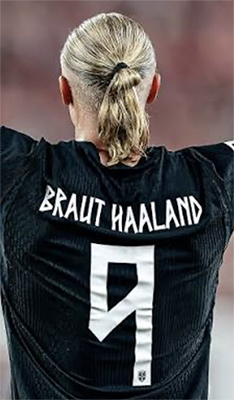
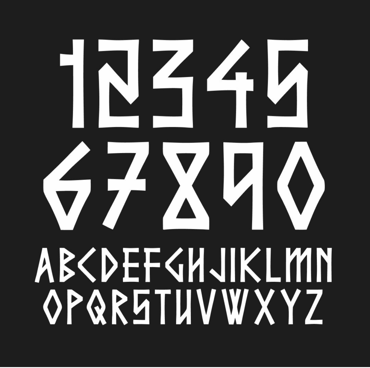
Taakeferd Condensed Typeface
So what was the inspiration behind the type design: runes. Runic alphabets were used by Germanic peoples as both phonetic symbols and visual forms. They were closely connected to the natural world of Norse society. And when you look at those symbols, their geometry makes perfect sense. Angles and simplified forms were the most practical for carving into wood, stone, and other hard surfaces.
Simple comes from understanding. When you understand the medium, the audience, the history, the environment, and the purpose, the design begins to make sense. That is what makes the Norwegian typeface so interesting to me. It takes something rooted in an 8th-century Viking visual language and translates it into something contemporary, recognizable, and functional.
It feels different, inspired, risky - and most importantly, it works. I love design that makes you stop for a second and say, “Wow. What is that?” And now can it live in the real world? For me, sometimes the best place to find a lesson in typography isn’t in a design studio. It’s on a soccer field.
— the brand auditor —