The 'gr' Dilemma: Analyzing Instagram’s New Wordmark
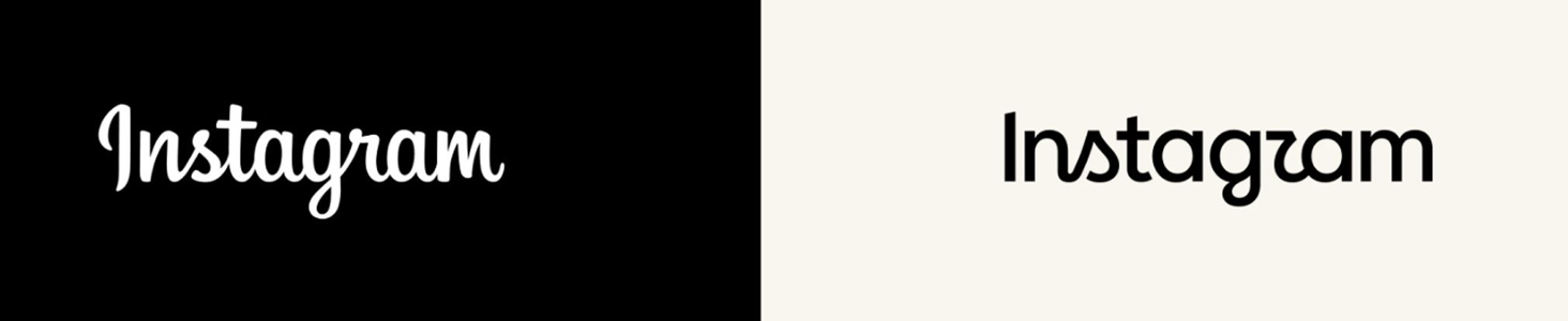
Oh oh - looks like there’s a problem. Can you see it?
The before is on the left and after, is on the right. Quite a different and bold refinement - but ……
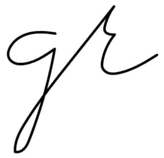
….. that ‘r’ is it working? Does it flow from the ‘g’ well? Does it bother you? Does it matter? Let’s consider what we see here, with our designer’s typographic eye.
Armin Vit said, that the new wordmark was designed this way acknowledging - “ Instagram is so embedded in our psyche that it can take a small gamble with its wordmark and not risk losing any brand equity in the process. Aug.24/26 BRANDNEW. I agree.
But, he went on to say that with reference to the typographic solution itself, in particular with the “gr” pair, he had hoped that the script flow of the “g” would have morphed into the “r” better. I ask - could it have flowed more naturally but also creatively? I agree here as well. And so I continue on more of an academic challenge than a debate of right and wrong.
I respect the designers and their team; they clearly did their due diligence and made their decision.
Instead, let’s move forward and treat this as a design exercise: How could that letter pair be resolved differently? Here is one way you could approach that challenge.
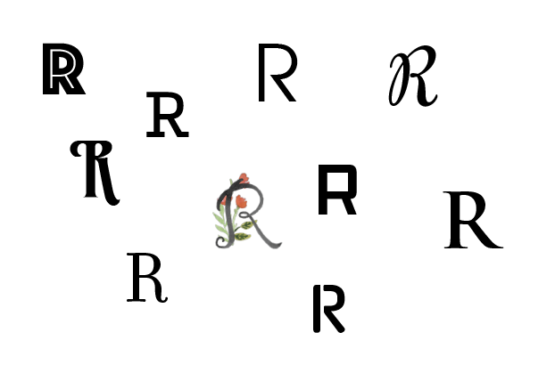
Deconstruct the Letter 'r' and the letter ‘g’ - look at the subtle details - like shoulder height and terminal weight …
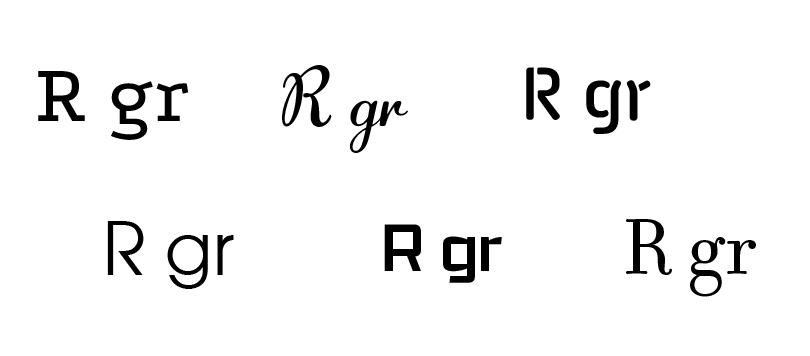
Study Existing 'gr' Pairs - How is this transition accomplished? Look at where the stroke exits the loop of the g and enters the stem of the r.
Return to Hand Lettering - Write the pair repeatedly by hand. Physical script reveals the natural rhythm.
I would include serif and sans serif because I can learn from seeing the diversity of their design, what are the small details which may help me resolve this problem.
In an article by Tom May, of the CREATIVE BOOM on Aug.19/26 - he discusses …..
The 'Instagzam' debate - isn't really about that letter “r”. It's about whether the company’s brand equity which means - the sum of consumers' thoughts, feelings, and attitudes about your brand that influences their willingness to pay for ... can be risky, break some rules, be possibly “illegibly” different?
Design judgment is a daily balancing act with each project being very different from the next, and with no single correct answer. Every challenge offers multiple paths, but as designers we still have to commit to one final stroke and ONE final choice.
Still loving each and every project’s process!
— the brand auditor —