
Marjane Satrapi - The Power of Knowing What to Leave Out
An Iranian-born French graphic novelist: an ode to a supreme graphic artist
Every once in a while you discover an artist who changes the way you think about your own discipline. For me, Marjane Satrapi is one of those artists. As a designer, I admire the economy of her drawing. As a storyteller, I admire her directness. Together, they produce something quite extraordinary.
The first thing that struck me about Satrapi's work wasn't what she drew - it was what she chose not to draw. She proves that a handful of black shapes and a few economical lines can carry more emotional weight than pages of beautifully rendered illustration.
Could these stories have been told in full colour? Perhaps. But I don't think they would have carried the same emotional force. As designers, we're often taught that colour carries emotion. Satrapi reminds us that sometimes removing colour altogether creates an even stronger emotional response.
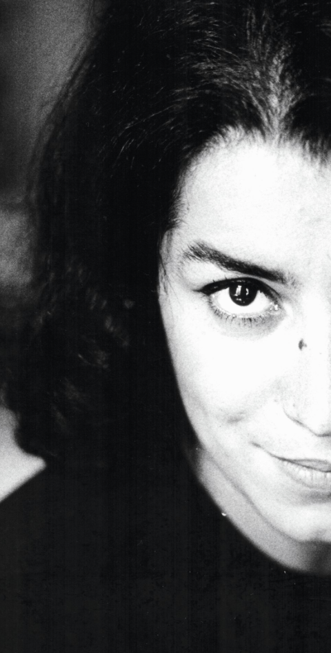
Satrapi chronicled her childhood during the 1979 Iranian Revolution in her groundbreaking graphic novel Persepolis, before continuing her story as a teenager living alone in Berlin. Her work is primarily black and white, with only the occasional touch of bold colour, yet it is emotionally rich. She strips away unnecessary detail until only the essential remains, emotion - not decoration, to command the reader's attention.
One quality I especially admire is her ability to balance humour with hardship. The word cynic has changed meaning over time. Today it often describes someone who distrusts the world, but the ancient Greek Cynics sought freedom through honesty, independence, and a rejection of convention. I find Satrapi much closer to that original ideal. Her work is never cynical in the modern sense. Instead, it confronts harsh realities with an unwavering confidence in humanity.
I've often found that adapting stories into graphic novels can feel forced. The words and pictures compete instead of working together. Satrapi never has that problem. Her drawings aren't illustrations added to a story - they are the story. Nothing feels decorative. Everything serves the narrative.
We spend years learning how to pay attention to detail. Marjane Satrapi reminds us that knowing what to leave out may be the greater skill. Every time I return to Persepolis, I'm reminded that illustration isn't about showing everything - it’s about showing exactly enough.
The best brands don't try to say everything either. They stand for one idea and communicate it with clarity, directness, and consistency - a blueprint for highly effective communication. Satrapi’s illustrations do exactly the same thing. She removes the unnecessary until only the message remains.
For me, that's the connection between great illustration and great branding. Both demand restraint. Both rely on purposeful decisions rather than decoration. And both remind us that the strongest visual communication often comes from what we choose to leave out.
This YouTube clip focuses more on the film adaptation than the books themselves, but it offers an excellent look at how her distinctive illustrations and storytelling translate to the screen. It's well worth watching.
https://youtu.be/0JDR9rMPEf0?si=xbdOyKyzWY1buJZq
— the brand auditor —