
Letterforms, Legibility, and a Medieval Revolution.
Pardon my nerdiness and love of all things type and history (when they intersect … simply great) - but I invite you to learn something I recently discovered about letter spacing and punctuation. That’s why.
Alcuin of York, working under Charlemagne in the late 8th century, was instrumental in standardizing Carolingian minuscule, a script that introduced clear word spacing, regularized punctuation (including early question marks), and a distinction between upper and lower case. This created a shift from scripta continua which means no spaces, to scripta discontinua which means there should be spaces, improving legibility and standardizing texts (latin) across Europe. You think it’s obvious, guess not.
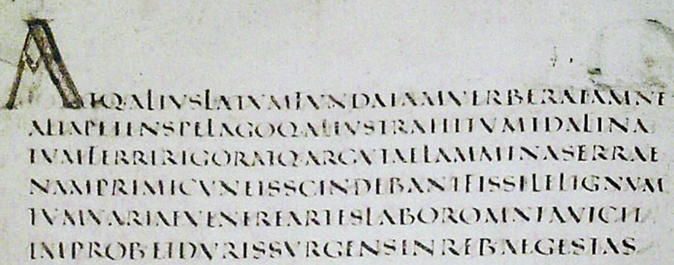
4th Century scripta continua
I recently came upon an article about Massimo Vignelli (a great designer) on mockiro, who spoke about letterforms and legibility. His favourite typeface was Helvetica - neutral and timeless. To him design wasn’t about style alone, it was about clarity and structure, about saying more with less.
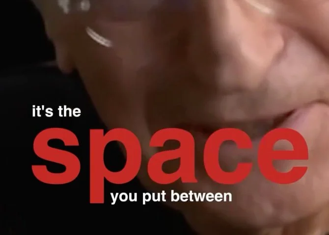
What fascinated me was that Vignelli understood something fundamental: letterforms are often as much about the space between them as the forms themselves. This echoes what Alcuin of York recognized centuries earlier - that the human eye struggles with continuous streams of text. Without spacing, words and phrases collapse into one another, reducing legibility and comprehension.
Alcuin of York worked on a key characteristic of this Carolingian script (miniscule), and it was legibility - the script was designed with distinct, mostly unconnected letters. It had a clear separation between letters and words - scripta discontinua.
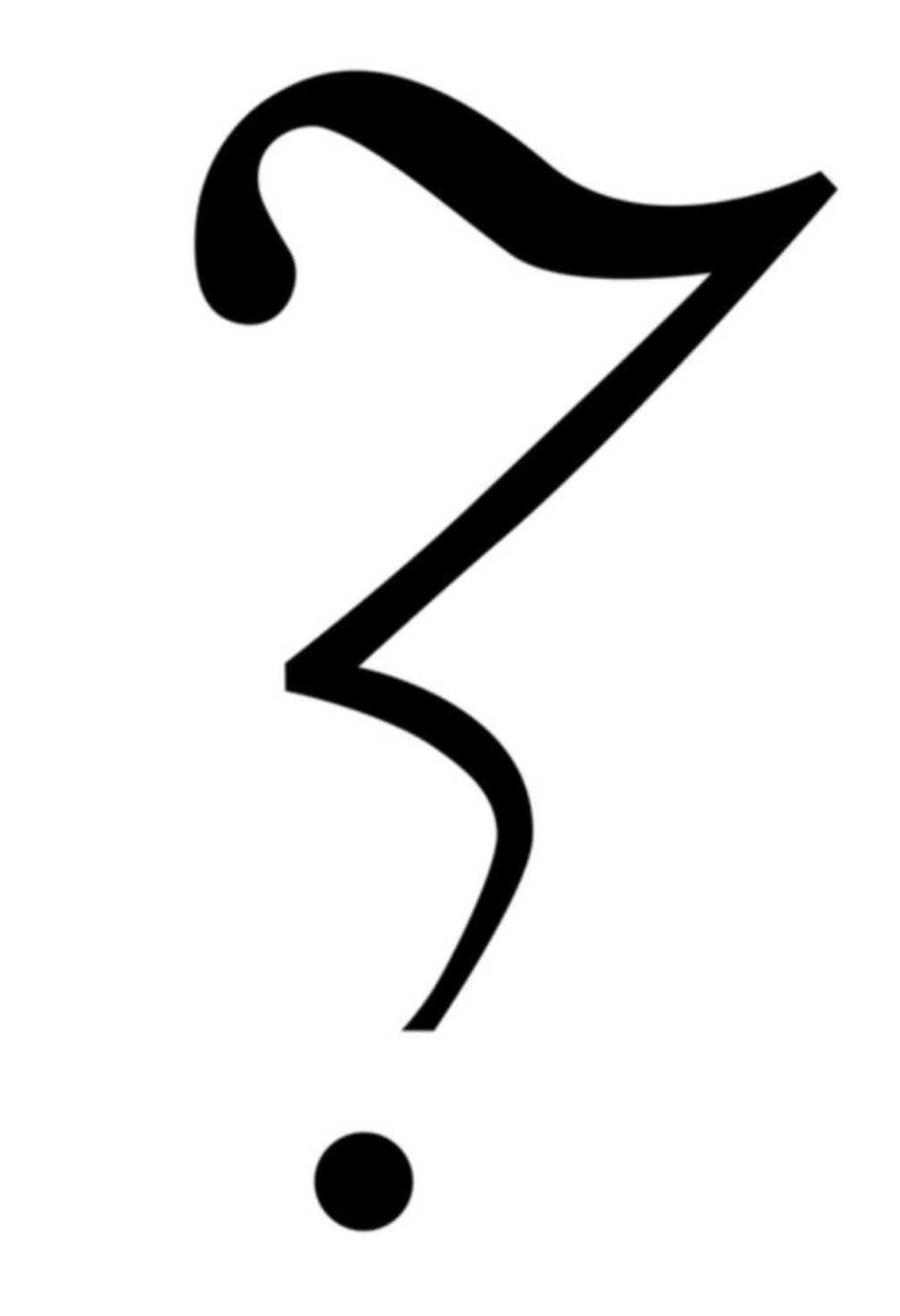
And then there is punctuation — one of the most important developments in the history of typographic legibility. Let’s sample the question mark, then called the punctus interrogativus. Alcuin of York is widely credited with helping develop this mark. Imagine trying to represent the inflection of a question graphically without it. Ask a question aloud and keep your voice ‘flat’, listen to yourself, and notice who uncertain the meaning becomes. The mark becomes a visual guide combining itself with the words to create a ‘full’ meaning.
French writer Hervé Bazin in 1966, played with experimental punctuation marks to express ‘nuanced emotion’. A fun example is his doubt point to which intends to express skepticism. It is definitely not questionable.
Lettering is about optical adjustments. Punctuation helps support those optics graphically. So cheers to the people who saw and continue to see, the importance of clarity, spacing, and expression, continuing to rethink and redesign it.
— the brand auditor —