
Clarity Lost: The Problem with Icon Redesigns
Why does the redesigning of brand icons, keep missing the point? Why do the brands seem to get harder to read? Redesigning brand icons - the how but more importantly - the why!
The ‘why’ of brand redesigning centers on it/they remaining relevant. But the how involves the action of solving for the problem and generally remaining simplified.
What to do?! Let’s get clear on what is the icon’s original intent - it is to make the brand’s familiarity clear via visual cues. Icons help continue to ‘brand’ the product or service (put it in your memory bank). Adding to the complexity, icons communicate across different languages at different literacy levels.
Once research shows a brand needs renewed relevance, the process often shifts toward a new visual direction. That’s expected. But in that shift, something can get lost. Icons at their best are simple and purposeful - not complicated.
But sometimes, the question becomes: are we solving the problem or is someone having too much fun with the process?
In the case of Microsoft’s 2025 redesigned app iconography …. there appears to be some graphic issues I’d like to point out but first there are a few things to consider. #1. the introduction of Microsoft Copilot - an AI-powered layer integrated into their existing Windows ecosystem. #2. the broader influence of AI on shaping design directions.
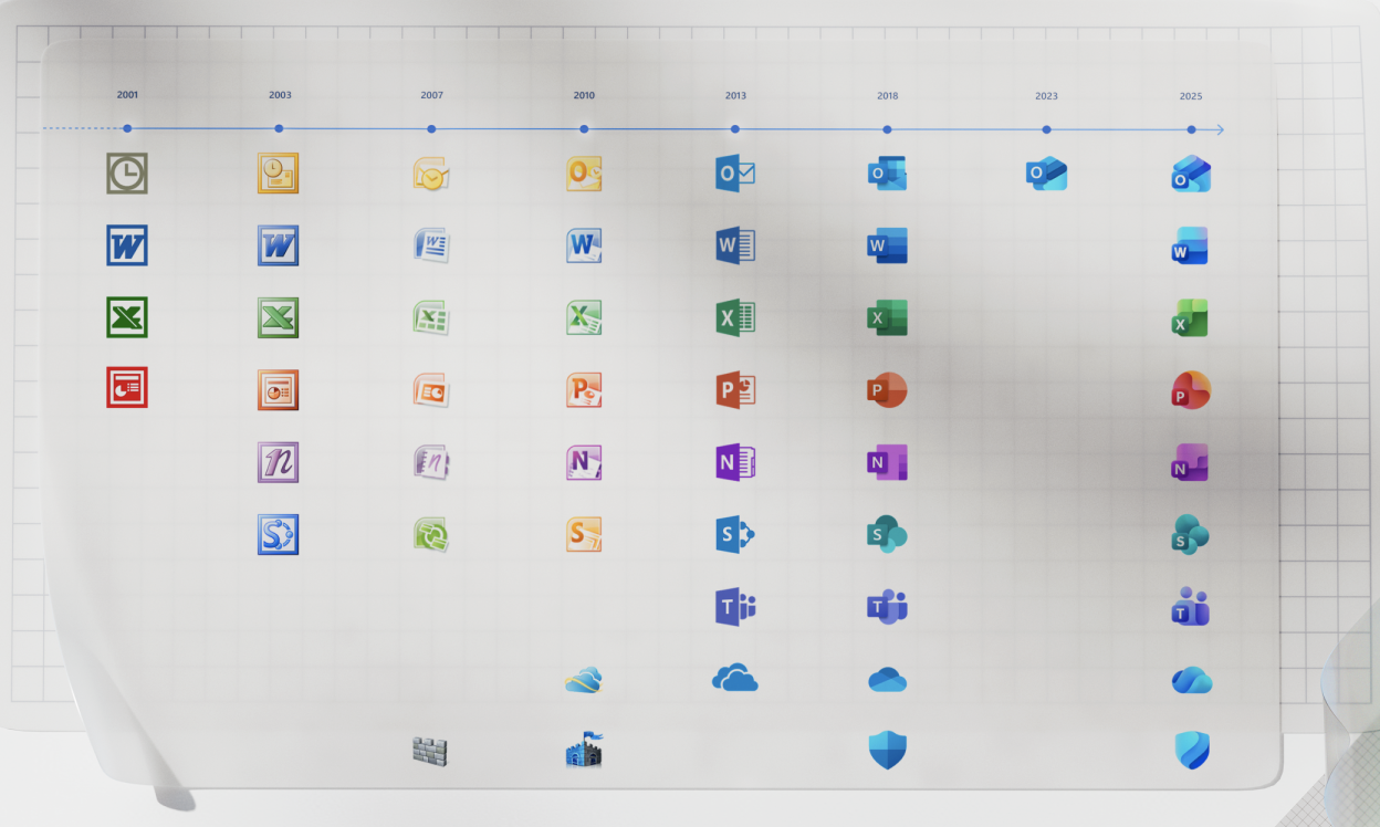
Microsoft 365 Gets Redesigned Icons: Here's Your First Look at the New Logos by James Peckham in PC magazine on October./2025 - displayed this MICROSOFT history worksheet (love this).In this MICROSOFT history, you can see the visual transition utilizing various graphic and textual methods (how it conveys meaning), while their company’s products become more sophisticated - and the icons appear more bold? simplified? trendy? clear?
This trend continues today with the ultimate in sophistication but in my view, equalling in complexity.
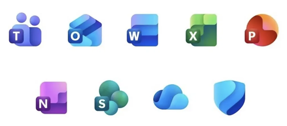
• There is a new graphic treatment, the ‘liquifying’ look - I do appreciate this, that is where we are at today. Yet, the devolution in graphic recognition of what the icon stands for, seems to have become what the designer is ‘having fun with’. There’s a noticeable decline in immediate recognition. The icons begin to feel more like aesthetic explorations rather than clear representations of function.
• Where letterforms are used - like the “W” for Word or the “X” for Excel, they provide a strong anchor for recognition. They help users quickly understand at what they’re looking. But when those cues are removed, the icons risk becoming simply ‘pretty’, without clearly communicating their purpose.
• The rounded shapes do make the icons feel more approachable, and the gradients add visual richness. Still, there’s a question of balance - especially when these designs need to perform consistently across multiple platforms and contexts.
Icons like the apple bite or the nike swoosh utilize “active odd” logic to create intentional imbalance - love this- It is a design strategy that uses asymmetry, imbalance, or unexpected, to disrupt visual monotony and therefore grab the consumer’s attention.

Designing an effective icon is challenging. Continuously redefining a brand is even more so. It’s a delicate balance, and the line between evolution and confusion can blur quickly - even with AI’s help.
I love the idea of designing any time I can - but there still has to be a good reason behind the decisions!
ps - fun fact - Historically, “brand” was less of a word and more of a symbol. It was derived from the Old Norse brandr, meaning “to burn,” it was both literal and physical. The shift from the physical to the abstract began when the mark moved from ‘identifying ownership’ to ‘identifying ideas’, probably in the 1950s and 1960s.
— the brand auditor —