
Want a shipshape deck?
Ok, so you are viewing a presentation deck with important information and data points, and trying to get through it without whispering to the person next to you - did you understand what we just saw?!
Whether it be a digital presentation or a ‘real’ presentation, the need for cohesive/clear information is the point of your time.

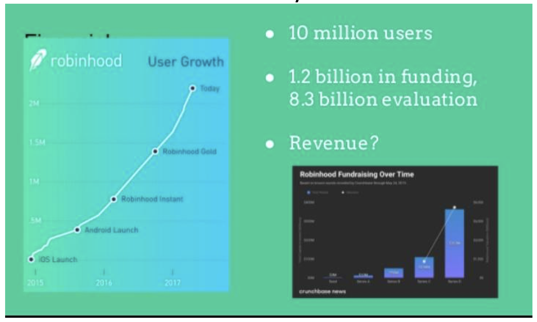
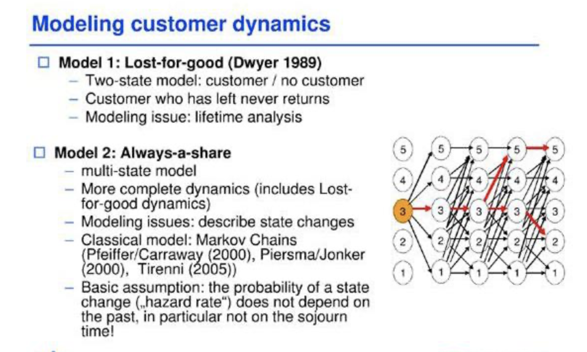
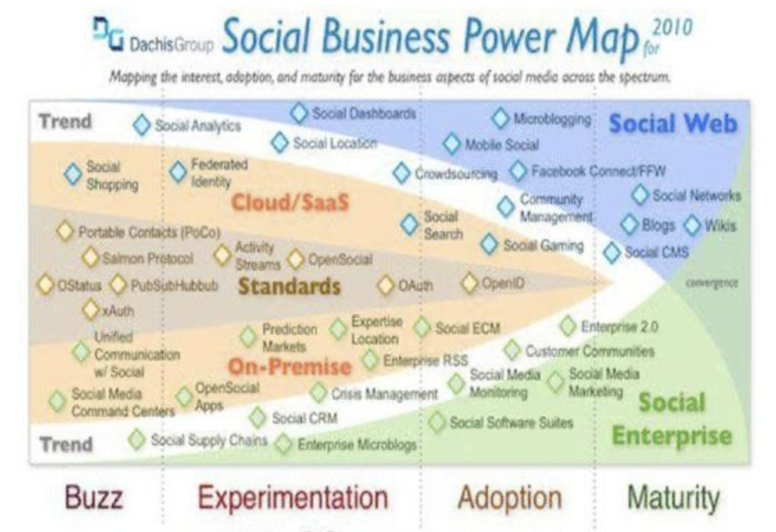
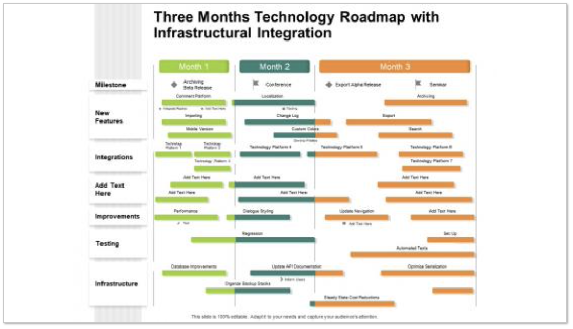
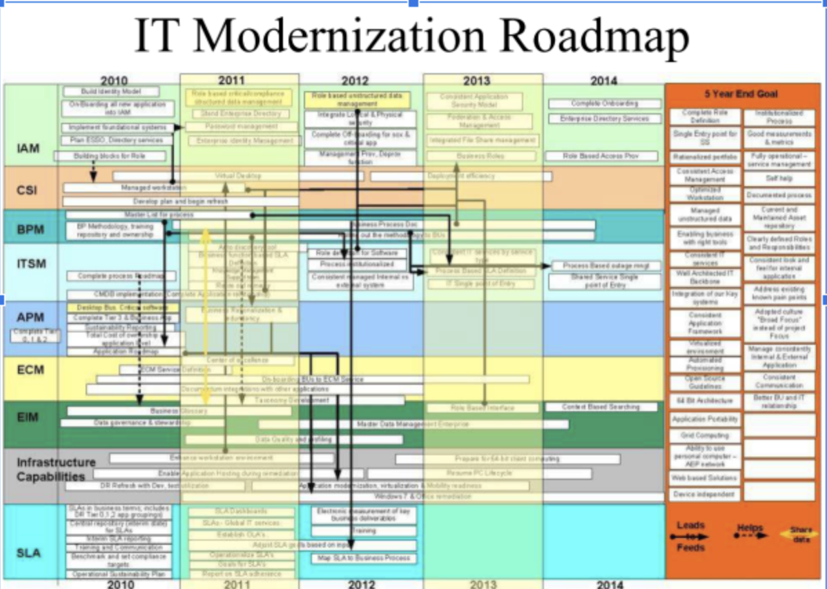
The above are sample google images of slides within decks and are simply representations of what I recently saw reflected within an important deck presentation for a successful startup company. Do you see a problem? I do.
The lack of clarity, consistency, and cohesion is very apparent. I say this not because it’s not pretty but because the problem stems from a desire to maximize the contents and minimize the optical ability to absorb it all.
Why? The optic nerve transmits electrical impulses from your eyes to your brain. Your brain processes this sensory information so that you can see and interpret stimuli. An experienced designer knows how to arrange and layout graphically the contents so that the information is clear - then we can’t process it properly.

Then, what are the solutions when one has a lot of complicated content and a limited space and time to present it?
Answer, utilize simplicity and consistency. These are very basic design principles which are often forgotten. Notice the image below of the many framed art work pieces shown on the wall.
Here, the main solution utilized was the use of a frame, not necessarily the same sized piece of art with the frame nor the same position (horizontal or vertical), but the continuous use of the same thickness of the frame and the same black frame colour. As well, in this example the person who solved the wall layout space, guesstimated the ‘perceived weight’ the eye sees and feels between the framed images and placed them eclectically, yet understood the principles of simplicity and consistency.
What does this do? Firstly it attracts the attention of the viewer, because it is easy to see and cohesively take it all in. It then allows the viewer to clearly see the information within each frame. And finally, it causes the viewer to remain at the point of visualization with sufficient time to easily see each individual piece of art, each displaying it’s own unique group of information.

Finally, a presentation deck should be designed so that they can serve dual purposes. First as an alive presentation tool and second, as a takeaway summary/ reminder of what had been presented. To be effective the information contained in the deck has to be concise, focused, presented both logically and in a visually engaging manner. In closing, it increases brand impact.