Type as a trope
… or a visual metaphor.
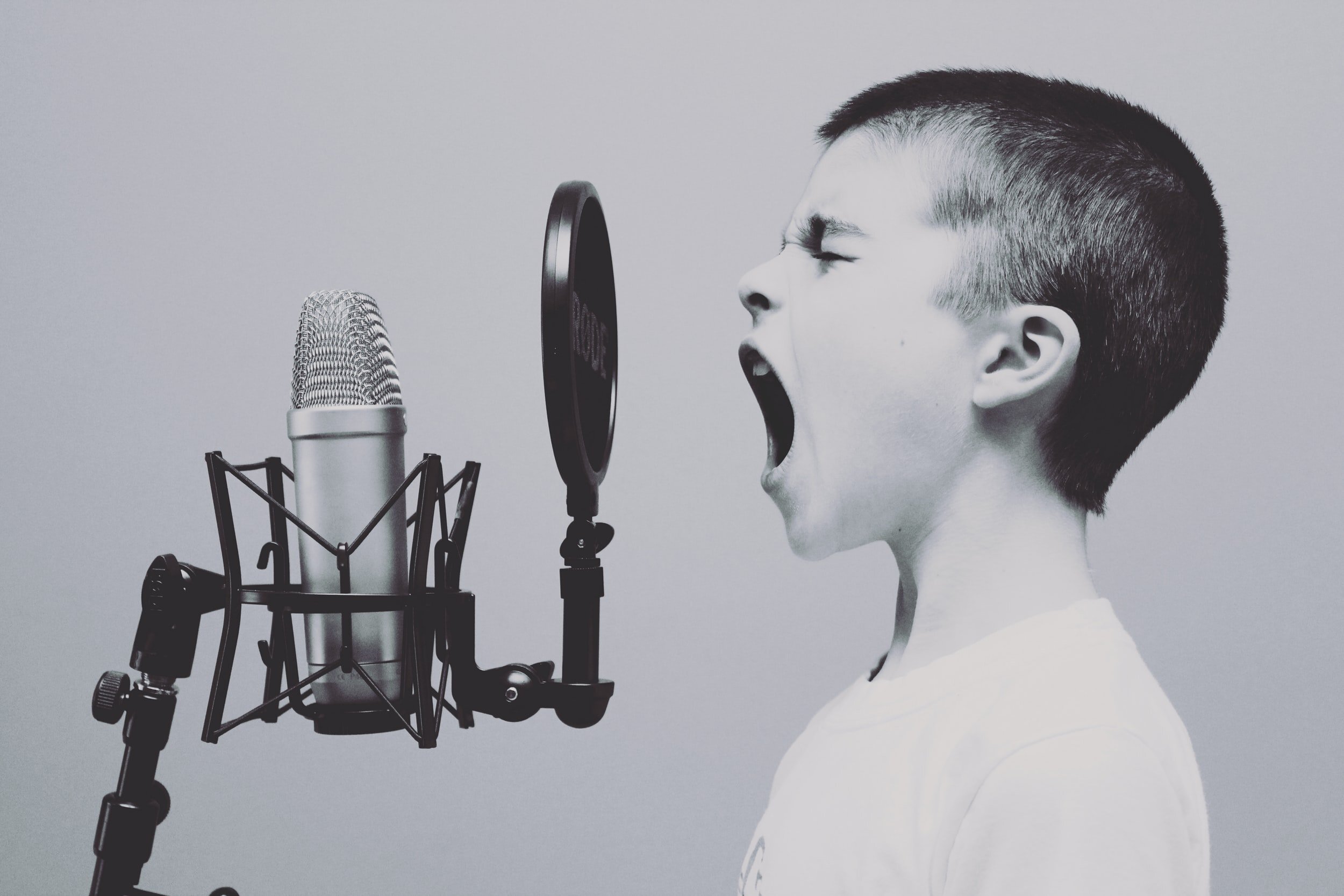
I love this statement … “type is the sound of words made visual” (Phil Garnham - Monotype).
With the scream above, what might this person be screaming, how would these words be visually reflected in them? Would there be subtleties that affect the way you interpret them?
Even in your head when you are not reading out loud, you are quietly in your head doing this. So, one does ‘hear’ words. Consequently it follows that these words carry emotion. Various sentiments are attached - depending on many things. Hence the variety of the visual expression, being - the type choice.
In a recent MONOTYPE seminar, I became aware of a logical categorization - 3 different choices - geometric, humanist and serif.
Geometric would be very clean, clear and utilitarian, forever modern - experiment with futura. Humanist is gestural and nuanced evolving from calligraphy - try calibri. The final one is Serif and echoes historical characteristics, contrasting strokes with thicks and thins - sample cotsford.
The sentiments created by the individual characteristics of these typefaces evoke different feelings. For example a geometric type option could be best used for a tech company. A humanistic face could be selected for the fashion industry and a serif choice might be picked for the fashion world.
Look at the 2 RK examples (they are 2 different Bodoni) and note the subtle changes in the letter designs by the green circles. They create a different perception, a specific emotion, like - honesty or value, or wisdom, …. Now think about a sans serif typeface and how it evokes a completely different set of psychological feelings. The importance of these nuances in letterform design and therefore typeface choice impacts the brand significantly.
Solving logo challenges comes down to the designer understanding what emotions the audience feels and this turns into ‘how’ they are looking for whatever they need or catches their eye. These emotions become words which could be - trust, innovation, quality, dependability …
Different typefaces, like the ones mentioned above achieve this well. But to an untrained eye, very subtly.
All this information is backed up by research and parsing out the data as well as it’s analysis. I know we don’t want to think of it that way, but it’s true.
What’s the purpose of this information and learning to see these details? It’s how a good logo becomes a great one! It’s how a a headline on a website or trade show banner, becomes memorable. It’s what I analyze to make those slight adaptions for a profound solution.
I see the beauty of each letter form evolve and blend with its surroundings to result in the correct word image. It creates, a fine painting of sorts but allows the viewer to feel what they need to feel and act on what they need to do. All that owing to the considered analysis that great designers put into play every time they are given a challenge to solve.
Here are a few titles I recommend from my shelves. I’m sure many are offered electronically as well.


