
“design exercise” vs “design solution”?
You might think you know the answer but, let’s talk …
How do you interpret an exercise for design? What would it look like? Would it be process of learning how to do one thing? or experimenting with a new learned technique and then accomplishing it? What would be the result of a well executed design lesson?

Do you think you have an answer?
What I see out there daily as well as on the web, are well executed design exercises. An image, type, audio, or any of their multiple combinations, projected as complete solution marketing a service of product - I observe these as demonstrations of a training process which is extremely important but not a demonstration of a completed design solution. This should not to be confused with appropriate lauding of an accomplished difficult technique. We as viewers often get excited about the newest ‘gizmo’ done using the newest computer software and like anything else which repeats, there is a possibility of it’s remembrance, enhancing the probability of deciding that it was great, that it was a great ‘design’.
On the other hand … when I see a completed design solution, no explanation necessary, it simply works, period.

Think Small - VW ad campaign
In the 1950s Doyle Dane Bernbach and Volkswagen decided to completely destroy the status quo for automobile ads of the time with the “Think Small” campaign.
The combination of concept, layout, element placement, visual hierarchy, colour treatment, great copy and typographic consideration, company logo and it’s positioning, ETC. all have combined to complete a solid clever design solution.
In spite of this being an ad before the advent and proliferation of the computer and multiple graphic software, the basic principles of good design and a great completed solution are the same then as they should be today. The tools are the only thing honestly which is different.
A poor design solution can go from information overload to utilizing the lastest graphic technique (the newest design gizmo = a design exercise) and possibly even repeating it as you see in this RECYCLING example.

too many popular type choices, large graphic elements, layout angles and more …..
With the use of the ‘visual technique’ (or exercise) of overlaying 2 lines of copy moving in 2 different directions as well as 2 different colours, may initially spark a wowy factor, but it is indeed simply a non solved visual problem within a graphic homepage layout - that does not work.
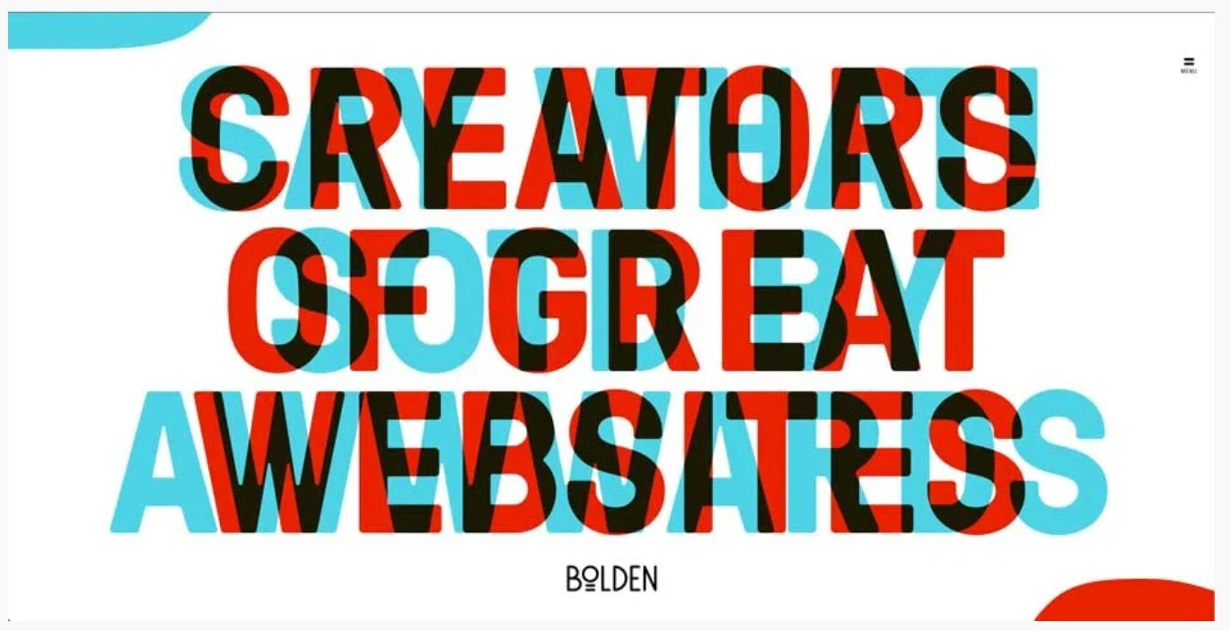
an old website page using a graphic type treatment technique.
Since so much of our world today is solved online, here are a couple of website homepages which I feel do a good job of solving their complete design challenges.


The 3 above are; to the point, visually commanding, answering the call to their respective audiences, balancing and off balancing the design elements, … done.
So what is the answer to the question at the start? It is not really one versus the other. It is understanding that they are different and serve 2 different purposes. The design exercise is to experiment with and to reach ‘victory’ in understanding it’s capabilities and how far you can push them.
The design solution is, well, a design solution.