
Don’t just use a cookie cutter template.
Be honest and look at most of the websites you see today, don’t they all look more or less alike?! Are you not bored as the viewer? I wonder as a designer if we have lost something in the process of making software so user friendly that all you have to do is create a square, fill it with an image or text, make it large or small, place it here or there and find a place for a button.
Can I not challenge the design community to at least create and entertain ‘above the fold’ on a website homepage?
Shall we experiment with some asymmetry to start?
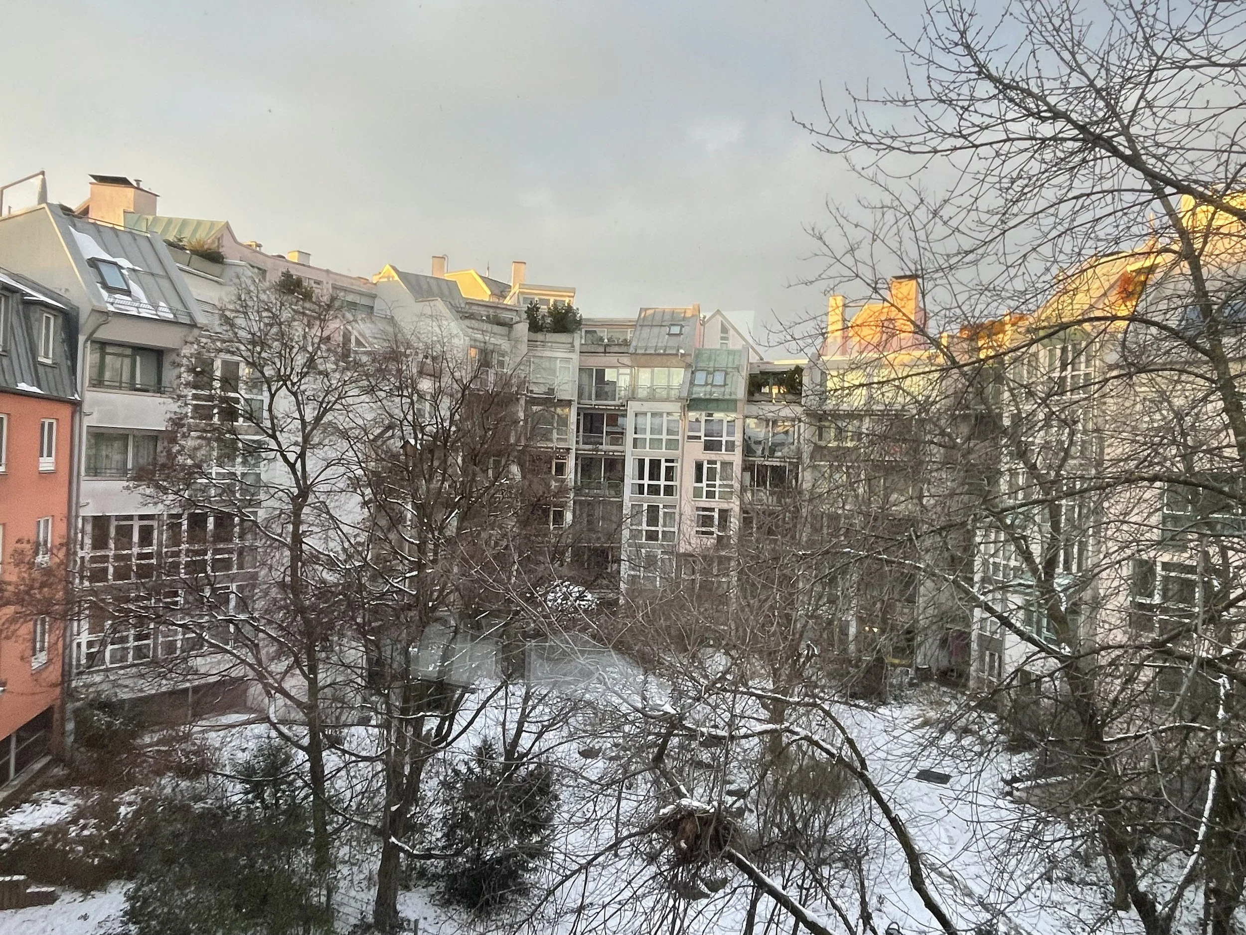
In the backyard court of a Munich neighbourhood is a beautiful illustration of this experiment - humanist, real, imperfect therefore comfortable.
Here’s another example within a different medium - check out the homepage, above the fold, of this company dotdotdash. As interesting as this seems this is not meant to suggest a trend for everything nor for every service. We are sophisticated enough at this point as constant smart phone and computer users, to find it (the navigation), even when it is not EXACTLY in the usual place?

Consider - when looking at the dotdotdash website, your eye sees it is within the confines of your computer screen size or when using the cell phone and accommodating its’ smaller rectangular screen size.
The logo/home button is on its side but in the accustomed upper left corner. The menu is presented vertically in the left margin rather than horizontally in the upper right area. These 2 visual placements are examples of attempting to be ‘a little bit different’ but not too dramatic so as to lose the user. It can be as simple as that. Change and uniqueness does not have to be encompass the whole homepage, just a twist to entertain.
It all comes back to the purpose of the task - for what, for whom, for where, for how long …
When choosing to exercise this option (which I highly recommend), do not negate that utilizing a template and NOT choosing to make glaring modifications, has logic too. Remember that you must first recognize your audience and list to your client’s needs. Then move a head with the appropriate design direction.
Order, simplicity, unity, and logic (without change) has its place. It too can be relaxing and cause less anxiousness.

I am glad that there is order in the world, and that there is order in my life, but I don’t need it visually everywhere all the time. I need a break.
sameness - Let’s try to avoid this shall we?