
Characters vs Glyphs - How the past informs the present
What can one learn from the historical trivia about type, as a designer today? Why should you focus on typography when obviously ‘the visual’ commands today’s presence and our collective eyes?
Typography can help brands establish unique personalities based on what they offer -
Type is central to every form of design, both print and digital. Typography has two main purposes in graphic design. The first is to promote legibility, and the second is to help communicate the messaging, tone, and sentiment of a design piece. Thoughtfully chosen typography contributes to a balanced, pleasant, reading experience that fosters user trust and encourages prolonged engagement. Knowing how to use typography’s letterforms effectively will determine how well you convey your message.
The letterform refers to the unique shape of a letter, with characteristics shared throughout a typeface. Letters are best referred to as letterforms - if you prefer to call them ‘characters’, I could go for that, because each one individually - is just that.
If a letterform is a character, then how do you define character? or do you really mean gylph?
OK, things are getting confusing, so let’s define these 2 terms - glyph and character: A glyph is a specific form of a character. Once we use the word form we are now talking about it’s ‘reality’, the thing.
On your computer, use the ‘glyphs panel’ to locate any glyph found within a typeface. There are all kinds, there are alphabetic ones, numeric ones and symbolic glyphs. Below is a more focused answer to what these 2 terms mean.
GLYPH
relates to how text is rendered
a designed unit, the appearance
they represent characters in writing systems
CHARACTERS
relates to how text is interpreted
linguistic unit, the meaning
they represent their meaning within a writing system
So a glyph is a specific form of a character. A glyph (/glif/) is any kind of purposeful mark.

Thanks to ‘wikipedia’ a sample of glyphs for an ‘a’ appears above.
If I may, I’d just like to add a little about the PUNCH - punch-cutting is a craft used in traditional typography to cut letter punches in steel, making metal type. The initial design for type would be two-dimensional, but a punch a has depth, and the three-dimensional shape of the punch, as well as factors such as the angle and depth, would affect the appearance of the type on the page. (thanks wikipedia)
PUNCH
the 3D mould which casts in metal, the shape of the gylph
Johannes Gutenberg (1440-1450ish) developed all the necessary parts for a complete, complex system for the mechanical printing of texts.
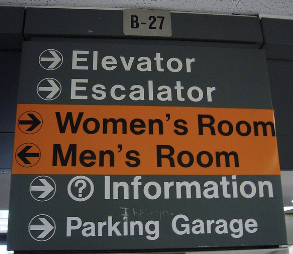
Notice the image to the left in the building signage, the uniformity of each letterform as well as the spacing between … shall I say it? - can eventually be seen and felt as monotonous.

As opposed to these 2 ‘R’s revealed here side by side, to the right. Both are capital Rs, both are letter punches, but each demonstrate separately, a different interpretation of the ‘character’ of the cap R. These are each glyphs - they demonstrate a beauty chiseled from metal from the past yet are not appreciated as much today as those created from within our pixelated, electronic options! C’est dommage.

Text files (software) process characters by moving them around, while glyphs are their visual representations. So today we simplify our conversation by referring to letters as characters for virtually all their references and I’m ok with that. But, I do enjoy a good ‘ditty’ about the history of language and its’ various representations. This curiosity has caused me to pay great to detail about each and every letterform - this extends to my branding focus and capabilities.
Baskerville’s question mark - I love that Antonio Cavedoni in his talk at LETTERFORM ARCHIVE at the San Francisco Public Library June 27/2023, referenced the design inspiration of this glyph to create a ‘Willy Wonka-esque’ version for their LOVEFROM typeface.

Finding the design roots of type can inform and inspire your design solutions. As I learn about the craft of conceiving and creating this art of communication - the letterform, it’s character and message can only become more refined, allowing me to clearly express the best possible design solution for each individual project.
To the glyph’s of the future, I look forward to their inspiration.