
Brand Your Own Script
What do you think about the capability of choosing a script typeface versus drawing it yourself?
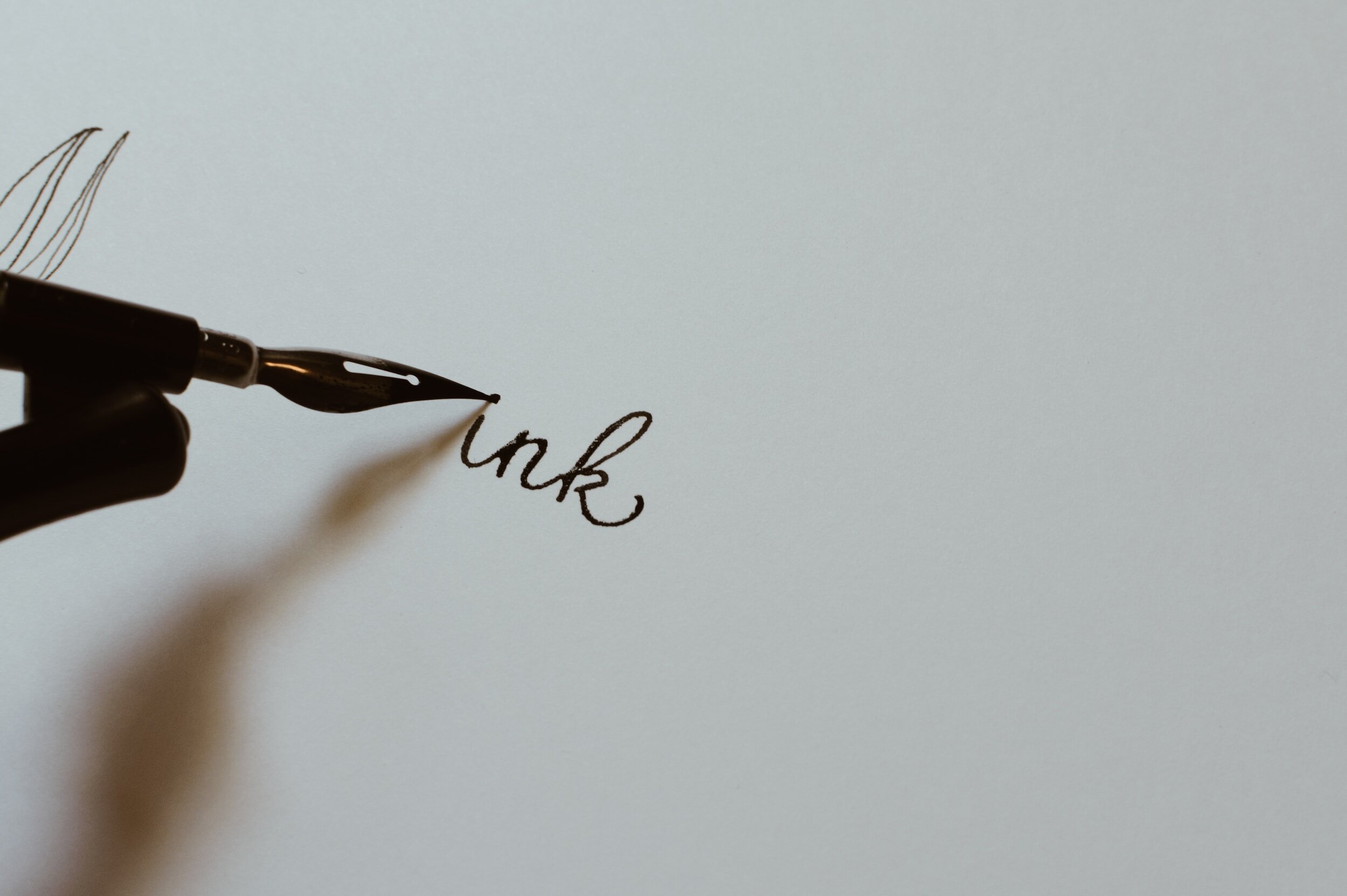
Before the Apple pencil or other various refined styluses (which have been so perfected over the recent years), the choices were to find a digital typeface created by ones and zeros to demonstrate organic, spontaneous, individual, fluidity - or - use a real pen on real paper and then scan in the hand drawn script and continue from there, utilizing it’s original look and feel.
What do you think would create the best outcome? hummmm.
Notice below, the uniformity of each letterform as well as the spacing between … shall I say it? - monotony.
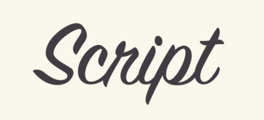
I rest my case here and then suggest - that to use mathematically created script typefaces is only for the convenience of quick placement of text, probably with the commercial intent to cause ‘character’ within given a content.
Given the capability today of the digital stylus/pencil which can emulate better ‘real’ script’ and is already digital, it offers a complete solution and allows for the character the designer is trying to achieve be real and therefore much more effective. This is true, but...
May I pose - that the signature below, composed by Queen Elizabeth the 1st of England in approximately 1560, with the use of a quill and ink on parchment (naturally textured paper), creates a beautiful and elegant depiction of her and therefore only her own signature, in the most sincere way.

When given a choice, I draw the script on real paper and scan it then move into the creative application world we inhabit and solve from there, but that’s just me, your choice.