
Brand Therapy
While I earned my MS in graphic Design from the Pratt Institute, after having spent the last 35+ years designing, teaching, mentoring … serving a variety of design experiences, I think I merit the equivalent of the advanced degree of ‘design therapist’.
It’s not enough to talk the talk without yourself walking the walk – moreover, all good therapists need to take a good look at themselves once in a while. Consequently, I must ask myself the same questions that I ask of my clients – what needs fixing and why.

Present situation - It’s been a while but it’s time to adjust the look. No I don’t mean my hairstyle, but I do mean my business card. Stop your giggling. Business cards still have value, especially when entering into a conversation with a potential new client or associate. Business cards are often still an important opportunity to make a good first design impression.
First Step: Self-Analysis - To assess what I should do and what I should not do, it did take some soul searching. Actually it took a proper professional analysis into to whom I would be presenting this card and what it was I wanted to express. It also had to ‘jive’ with the modified new look of my new website.
Layout - choosing a size begins the process, and simplifying that choice by using a standard size expedites matters. I opted to use a template. (I used MOO.com, as I find it the most flexible among the offerings of template companies.) I chose a simple informative layout to allow the words to speak for themselves.
Logo - the existing logo remains the same as it continues to serve both my design and marketing purposes. However, owing to the space limitations of a business card vs a website (card stock 3” wide vs digital backlit screen approximately 15” wide), I selected a different presentation of the logo. My logo on the card is horizontal but on the website, it is stacked. My experience told me that deconstructing the logo as opposed to simply scaling it would allow the same brand recognition while better serving the content of the website.
Design - 1. purpose - After many years of focusing on offering graphic design services, I have decided instead to highlight brand consulting while secondarily offering design services. 2. whom am I trying to invite/entertain and convert? By changing the focus of my services I am targeting the field of my potential market. I am looking to appeal to companies and organizations who may have an existing creative team but who need someone to help them get UNSTUCK as well as see new creative solutions.
Challenge - how do I reflect this in my new card?
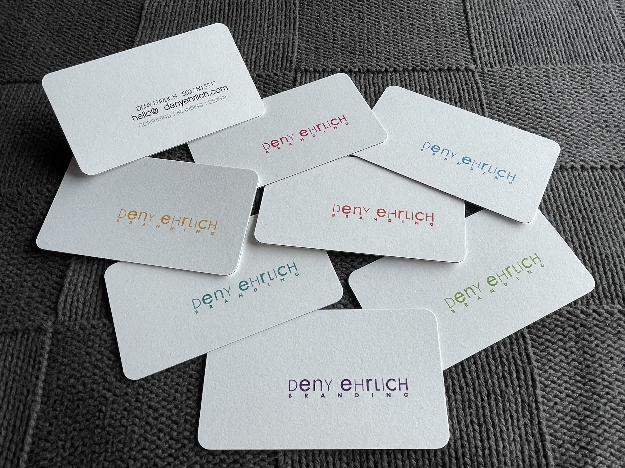
My Solution - I ultimately determined that I had 2 messages which I wanted to convey via my business card. #1 - reflect a message of experience, wisdom and timelessness. Here I accomplished this on the front face • white background • heavy weighted card stock • rounded corners • variations of charcoal gray text plus a sandwiched fine black line around the edges. #2 - demonstrate these characteristics - diversity, creativity and flexibility. back face • horizontal position of logo, off-centered • multiple colour treatments. Consequently, the front and back of my card while retaining the same basic design elements, each convey the 2 above complementary messages.
the Business Card - Colour means different things to different people in different parts of the world. By offering multiple colour offerings I am ackowledging the diverse group to whom I would like to work with as well as well as the breadth of knowledge and experience I offer.
couch photo - saraloftus.com
When you take on a creative task, be prepared to analyze all the elements - the colour, the copy, the visual and maybe even the client’s perception.