
Trend setter - to be or not to be?
Do you want to break the grid and be a trend setter? OR - do you simply want to exploit the most current trends?
First you need to ask yourself, which is more important relative to the desired successful outcome for your client’s project request? To answer this you must first do some research.
• What are the trends that you are noticing?
• Do you observe a pattern?
• Is the trend demonstrating market success?
• Is it attracting the attention of those whom should be ‘looking’?
Now, ask the question - if successful then why would you not want to emulate it?
You must also ask - if there is a trend and EVERYBODY is employing it, then wouldn’t it be prudent to do something different?
I can’t say that I know definitively which route to follow, but I do have an opinion.

Keeping up with the trends helps you stay in the game, but is staying in the game the same as getting attention? When taking this tack, it is very important to review the evolving customer needs and preferences for the specific project.
If the audience changes, for example; their ages, their interests, what they are looking at on which social media, ….. then the components that make up the brand = the messaging, the positioning, the identity - may need to be reassessed and possibly modified to reflect the new direction of the audience and therefore the product campaign.
There is an opportunity here though.
Upon reviewing the brand today -
• reading the future as best as your data and research allows
• reviewing the history of the brand
• what works and what does not work
Maybe the next steps might be - a few astutely positioned changes. Not a total rebrand but a refresh? Having learned from the company’s product history - bring some elements forward and make changes albeit subtly but effectively!
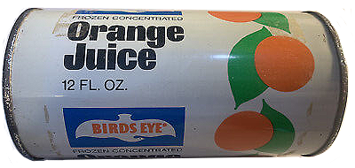
In the examples below, TROPICANA, SUNKIST and BIRD EYE - all they did was what all good orange juice branding did - they used the white background for their packaging to layout their product graphics and text. Very solid, but repetitive. They all used oranges, they all have green leaves, they all place their company name/logo big and bold at the top?
So, how does that increase competition if everything looks the same? How does one stand out from the other?


In 1965, MINUTE MAID may a risky decision and went against the tide. They decided to make a very bold and visible change. They used black as the background colour rather than white. They still used an orange. They still placed their name/logo big and bold at the top although the letterforms were now in white against the black background creating the great contrast and therefore attracting the most attention.
The key word is RISK and within that risk basically changing only one but style very significant design element. Eventually the market did show consumer interest demonstrated by their increased purchases.


Logos and projects following trends eventually begin to blur together. The work can appear ‘institutional’ since it’s been seen in such similar arenas. On the other hand, taking risks can set you apart and be seen as innovative and staying ahead of the curve - but it is a risk.
Sooooooooo, for starters, to get your creative none traditional juices flowing, here’s a thought as to how to not completely follow the trends - try wearing different crazy/fun socks. For that matter, try wearing 2 different crazy socks. It does inspire me, even when I get those raised eyebrows from those at the corner coffee table across the room.
Since halloween is around the corner, be the first ‘on the block’ to not use the colour orange. Be original. Stand out and command attention - for your client.
Noteworthy - although Tampa International Airport has been going through a major expansion with the development of a new airside terminal, they decided not to change their logo (originally designed by Jane Davis Doggett). Why? because there was no need, no trends necessary to follow. Now that’s solid!— the brand auditor —