
Slicing and Dicing the Word Salad.
As the visual design of logos have undergone changes, so has the definition of what a logo is defined by - today.
A workmark or a logotype is a text-based logo. It is created from type, no illustration involved. It uses spacing, weight, baseline, colour - these kinds of ‘treatments’, to design and vary the solutions.
A logo is - any mark that represents your brand or product, visually. Given the definition of a logotype - does a logo need to include text? well, not necessarily. Ok, so does an icon that symbolically representing a product or brand value need to be included when designing a logo? uh-uh (no).
TYPES (meaning kinds) of LOGOs:
Lettermark (or monogram)—are logos that consist entirely of letters (not words). ex/ HP, IBM, and HBO. NASA is short form for National Aeronautics Space Agency, therefore shortening it to its acronym made the most sense, hence utilizing the NASA and logo-izing it.
Wordmark (or logotype) is similar to monogram - both are entirely type-based. But a wordmark adds character visually to the full brand name, its letters. They utilize uniqueness in the design of their letterforms. They do not have icons or symbols. ex/ Disney.
Brandmark (or symbols) are purely graphic based. They are also called icons but this term seems now to relate specifically to the digital world therefore make sure you are clear when designing (what it’s for). ex/ MasterCard.
Mascot are often whimsical characters. These are most often illustration-based. ex/ Tony the Tiger - Kellogg’s Frosted Flakes cereal.
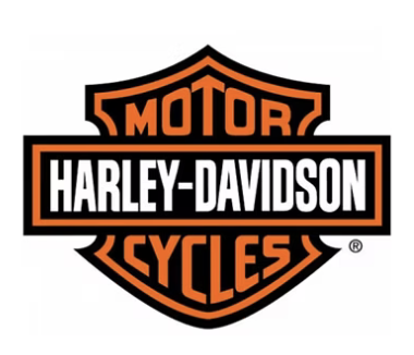
Badge - or an emblem - is designed and contained within an enclosed shape. ex/ Harley-Davidson.
Combination mark - this is what most people think of as a logo! it is actually a traditional logo comprised of a type-based and a graphic-based mark. It is very brand forward and what most companies probably expect. It is the most versatile choice.
The word - LOGO is basically the overarching term.
Be aware that, all of these ‘options’ can be used in tandem (or on their own - depending on the clients needs) to build a successful visual brand. Brands evolve over time.
Today you can use AI to generate a symbol or stylize a name treatment. BUT, what AI can’t do, is help you decide - WHY and WHAT and WHICH … and that’s where the designer still fits in, especially one with experience!
So much is involved in the strategy and the logic of what to do. For starters - what is the client’s industry? Who are their competitors? Which audience are they going for? Who is their company, their brand? Do they already have an established brand recognition or are they new to this arena? Are they a non-profit or retail? B2B or B2C? VERY important questions to pose at the beginning of the project!
As a designer I create what I call a ‘master logo’ which generally includes - an icon, the company name as well as the company tagline or slogan. These 3 components make up what I believe are the rudimentary elements most logos need and from there the designer can demonstrate ‘deconstruction’ of the logo - which means - using the different elements on their own as well as I combination.
You decide - Leverage your experience to guide the client, not just implement elements. Educating them on the strategy behind the design is key to delivering true value.
— the brand auditor —